Primary Button
Main call-to-action button with gradient background
Copy and paste beautiful, responsive components built with Tailwind CSS. Customize them to match your design.
Showing 17 components
Card with icon, title, and description
Lightning-fast load times and optimized code for the best user experience.
Pricing card with features list
Styled input field with focus effects
Multi-line text input with focus effects
Full-page glassmorphism login and signup form with theme switching.
Glassmorphism Login/Signup Preview
Centered container with max width
Content goes here
Responsive grid with 3 columns
Item 1
Item 2
Item 3
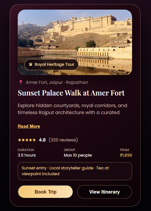
A luxurious royal heritage travel card with image, rating, trip details, read-more toggle, and elegant gold-dark UI.
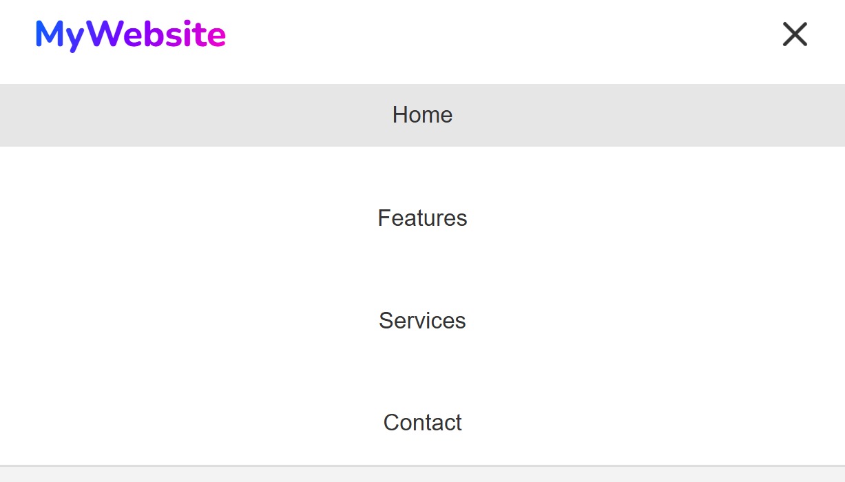
A responsive glassmorphism navbar with animated hamburger menu and smooth mobile slide-out panel.
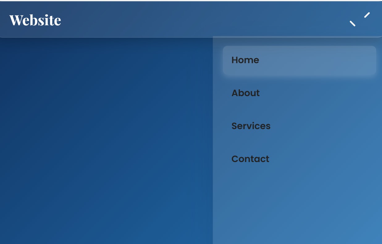
A modern glassmorphism navbar with mobile hamburger menu and smooth slide-in animation.
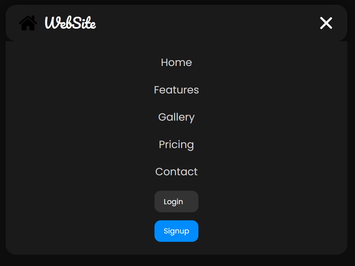
A sleek, responsive dark-themed navbar with animated links and mobile hamburger menu.
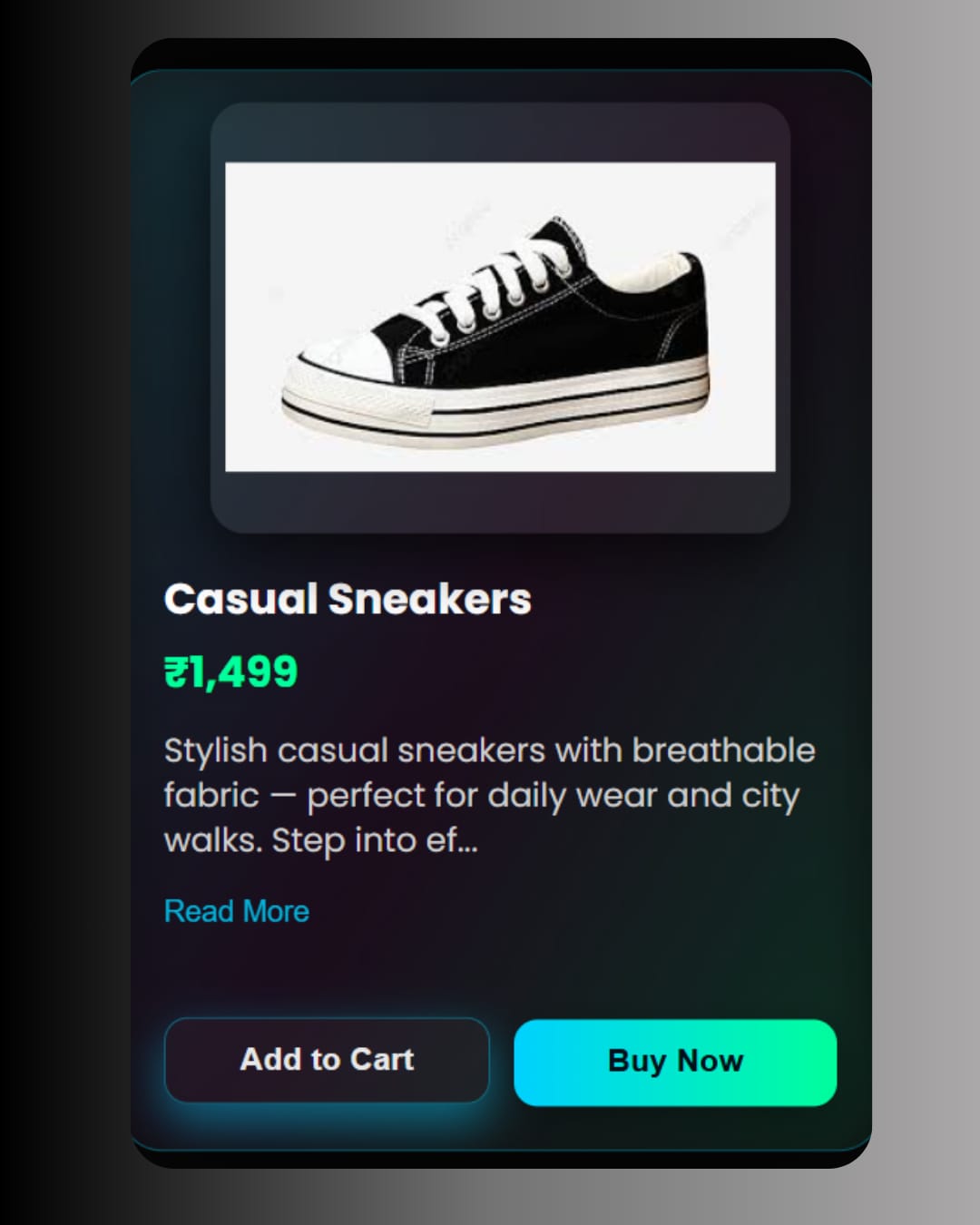
Neon-glow, glassmorphic footwear product cards with hover effects, responsive layout, and theme toggle support.
Edit the componentData.js file to add your custom components to this library.
src/app/component-library/componentData.js